Saturday 19 February 2011

Something random.

Hi all, it's been a loooooooooong while since I've been posting stuffs onto this blog. I wishes that I could have the extra time but the tight schedule and my twisted lifestyle have made it nearly impossible for me to update this blog frequently. My apologies and I promise I'll readjust my times and also updating this blog more often. :)

First of all, what I'm going to share here is something I've created out of boredom about a month ago, inspired by a typographer(some how I've forgotten his link and I swear I didn't try to plagiarize his work! LOL)

This is practically created just for the purpose facebook or msn messenger display picture. Could be made into a poster if the length of the artwork is stretched. So far the concept is exactly the phrase "Love what you do, do what you love" The colours used are Black as background and White & Red as the text.  I try to make as as simple as possible by highlighting the 'LOVE' word with red and thus creating the focal point of this artwork in overall.(And yeah, I admit that I have a great obsession in the combination colour of red, white and black... =.=")

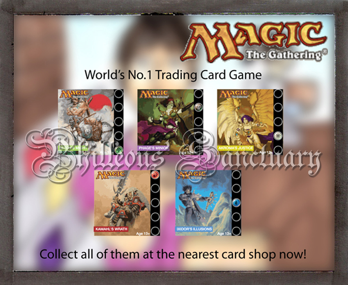
The second thing I wanna share here is a logo I've created for a private group in facebook, which is founded by my fellow hometown friends that played the trading card called Magic: the Gathering with me. Although there are only 5 of us(4 to be honest, as 1 of us doesn't have a facebook account), the group serves as a 'head quarter' for the 4 of us to discuss about the news, the strategies of the card game and even post our the card list there for trading purpose.(Duhh, what is a trading card game for then? -_-")
Being part of the group, I feel obliged to contribute something for it and thus I came up with an idea of creating this group logo.

The concept for this logo is simple: straight to the point. I used the typeface called Futurex Phat because I think that the typeface did gives me a kind of a very sci-fi feeling and I believe that my groupmates would prefer something that looked futuristic rather than something that looked  rather old school.(while the card game is more fantasy-based comparing to sci-fi based -.-") The 'KB" stands for our hometown, which is called Kota Bharu(the capital city in Kelantan state, Malaysia) and the 'MtG' simply stands for 'Magic: the Gathering'.
The five icons at the middle is the original icons of the 5 colours of Magic: the Gathering cards. Although I didn't asked for permissions to use those icons but I still hope that I won't get into trouble by doing this. It's not for commercial purpose but just some private group purpose by the way. >_<"

I'll be updating my blog with recent and previous school work ASAP as I'm still in the midst of preparing it and my finals are at the mid of May. I hope that my Self Directed Studies could pass with flying colours and most importantly, I get to learn something during the process! So wish me luck, folks! all the best to you all and have a nice weekend! =D


With love,
Philip aka Philleous

Saturday 13 November 2010

Another Discovery...

Hola! It's been a hectic month at the University and all I've got to say is "That's the student lifestyle!" Working life will be much more of a hell compared to this. It's been a time that I didn't experience the student lifestyle and this time it's just right about time for me to experience it once again before start working! All Hail Student's Lifestyle!! XD

Alright, this time the piece of artwork/sketch/whatever-you-name-it is an old piece of junk I produced during my working period in Malaysia(Apr 2009 - Jul 2010) due to boredom. There's no actual concept in this piece of work, just mere sketching of what comes into my mind. The medium used are just 4 different coloured ball pens on plain A4 paper... And I named it China Doll... LOL
Enjoy.

Friday 1 October 2010

Discovery of the Forgotten...

Greetings! It's been so exiting and exhausting for my 1st week at UWE, Bristol, but I think I'm doing good and still can cope with the pace! Good thing! =D

During the process of cleaning my laptop files earlier, I've discovered something that I've done during the 1 year and 4 months working in Mega Harmony Sdn. Bhd.. This is a brochure I've designed for my boss' niece, Eve & Adam Wedding Lounge, a wedding planner service.


Tuesday 28 September 2010

1st post!! :D

Well, after seeing so many of my friends created blogs of themselves and uploaded their awesome works onto it, I start to have some sort of the same thought of doing so, but in the end there are just thoughts and no actions taken. Until the day I finally receives the Assessment Brief of my Uni, I think to myself :  Hey dude, what are you waiting for? Show them what you've got!! :D
And... ta-da!! Here comes my first blog!! :D :D :D


Erm... Hold on, did I missed out something?

Oh yea!! My apologizes for forgetting my manners. Philip Tan Kian Kar is my name, although I uses Philleous as my net name and my family usually calls me Kar. I'm a Graphic Design student that has just graduated in The One Academy in 2008 and currently taking my Degree course in Bristol, UK(and this is also 1 of the reason this blog is being created, in order to show my portfolios)

So let's get straight to the point. The images below are the artworks I've produced through out the college time while I'm studying in The One Academy. There are some freelance job, too and some are missing as my previous laptop have been snatched by a snatch thief. :(

So Ladies & Gentlemen, please enjoy. :)

Advertising Campaign 2: Thalassemia Awareness Campaign(Group work)
Mirror &Banner:


 Brochure:


 Poster:


TV Commercial:
By YYY


Advertising Campaign 3: Story-boarding
Storyboard 1:


This is a storyboard of a trading card game called Magic: the Gathering. This concept is a soft sell concept of how the characters in the storyline conflicts and united in the end.


Storyboard 2:


This is another storyboard of Magic: the Gathering, in soft sell concept.


Corporate Identity: KTM (Group Work)


 Figure Sketching & Marker Rendering


Photography:


Portfolio Presentation(Personal Webpage Design):


Practical Training (Monthly Knuckle Calendar) 


Packaging Design: Sandal Box


Publication 2: Annual Report


Publication 1: Magazine Design


Typography:
Poster


Tagline: Art is not truth, art is a lie that make you realise truth.


Booklet


Typo Booklet, typeface: Kelmscott Roman


Freelance(Hei Yue Tong):

Hei Yue Tong mooncake company wants their mooncake packaging to be Japanese orientated. That's why I suggested using washi paper(A kind of Japanese luxury paper with beautiful drawings) and they agreed.


 Thus I proceeded with rough sketches.


Finally I came up with this final outlook:


This freelance job of mine has being rejected by Hei Yue Tong Mooncake Company at the last minute due to the disagreement of the pricing. Therefore, I've decided to keep these piece of work as part of my portfolio.


So guys, please feel free to drop any comment!! :D 
I promise that this blog will always being updated!! Would like to share some of my UK life experience here, too!! :D